So far, I am enjoying improvements to how themes are handled in ggplot2 4.0.0. The new ink and paper system is really useful because of how it handles propagating the colors to layer defaults. However, I did get myself into a little bit of trouble recently with how it applies blended colors to various plot elements. In this article, I’ll recreate the issue I ran into with my theme and show you how you can detect and fix this easily in your own themes.
When I was throwing together some plots for a college football analysis article I was writing, I decided to try using Clemson University’s purple color as the ink for my plots. I know from experience that this purple can be used against a white background with sufficient contrast, but the resulting plots actually had axis text that was a new blend of purple that was hard to read and failed to meet accessibility standards.
WCAG 2.1 requires a contrast ratio of at least 4.5:1 for normal text (crucially, including images of text). The ‘colorspace’ package has a function which we can use to measure this in R. This is important because the standard is intended to ensure text can be read by people with moderately low vision or impaired contrast perception. All viewers of a data visualization depend on the legibility of the axis text to understand the magnitude of the data and the scale of the axis, so ensuring this text is legible is a core requirement of communicating data effectively.
Detecting Inaccessible Axis Text Colors with colorspace
To start, I’ll load the ‘colorspace’ package and define my purple color, which is called regalia. Using 'colorspace', we can check the contrast ratios of colors easily.
library(colorspace)

regalia <- "#522D80"

contrast_ratio(regalia) # color2 defaults to white
[1] 10.26481
This is far greater than the minimum, showing that text in this color will have enough contrast against a white background.
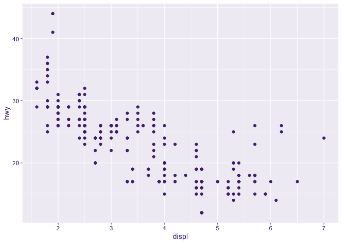
So let’s go ahead and see what happens when we use this color as the ink in a ggplot2 theme. I’ll use theme_gray() for this example:
library(ggplot2)

ggplot(mpg, aes(displ, hwy)) +
  geom_point() +
  theme_gray(ink = regalia)

At first glance to me, this looks pretty good. It uses my purple plus some blended versions. But the longer I look at a plot like this, the more it becomes apparent that the axis text is somewhat hard to read. That’s a good hint, but maybe you can read it no problem. That’s why it’s important to look at the actual colors used and check the contrast ratios.
new_axis_purple <- theme_gray(ink = regalia)$axis.text$colour
new_axis_purple
[1] "#866CA6FF"
Ah, so the axis text is a different purple! Now let’s check the contrast ratio of this new purple against a white background:
contrast_ratio(new_axis_purple)
[1] 4.459237
Remember WCAG 2.1 requires a contrast ratio of at least 4.5:1 for normal text. So this barely fails, but it fails.
In general, prior to ggplot2 4.0, most people weren’t going out of their way to customize axis text with low-contrast values. But now with the whole ink/paper system and blending, you can accidentally end up with insufficient contrast even if your initial color choices aren’t naive to accessibility concerns.
Fixing Inaccessible Axis Text Colors
If we want to continue using the same ink and paper, we simply have to override the color for axis text with something that will have sufficient contrast against the paper. For example, I could use the regalia color for the axis text, which I already showed has sufficient contrast against white:
ggplot(mpg, aes(displ, hwy)) +
  geom_point() +
  theme_gray(ink = regalia) +
  theme(axis.text = element_text(color = regalia))
And let’s confirm that the override worked:
(theme_gray(ink = regalia) +
  theme(axis.text = element_text(color = regalia)))$axis.text$colour == regalia
[1] TRUE
Cool! And the difference between the two plots is subtle I’ll admit, but the second is clearly darker and easier to read if you A/B them in the RStudio viewer.
Looking at the output of just the theme object will let you see where defaults are being overridden. When I did it for the theme_gray variation from the first plot, I didn’t notice any other text colors getting overridden besides axis.text.
Conclusions
The example I’ve shared here clearly demonstrates that the axis text color in your ggplot2 theme might not have sufficient contrast on your paper color, even, even if your ink color does.
Since the margin between an accessible and inaccessible plot can be thin and isn’t necessarily easily visible, I think it’s worth the effort to check contrast ratios when you pick custom ink/paper colors for a "publication-grade" plot. The “eye test” does not suffice here.
I don’t think the fact that I stumbled into this little gotcha means you can say anything bad about the theme improvements in ggplot2 4.0. In fact, the existence of ‘colorspace’ shows that the R ecosystem already has applicable tooling that you can build into your workflow for exploring/building ggplot2 themes.
If you’re working with highly dynamic theme generation code in shiny apps or with LLM agents, you might want to consider using colorspace::contrast_ratio() to validate that the generated themes meet accessibility standards before applying them to plots. In fact, this is something I wanted to add to my experimental ggthemeAI package but I previously had trouble finding ‘colorspace’ via Google.
‘colorspace’ is a great package with lots of other applications for data visualization. The colors we choose in data visualization matter a lot. If you make the wrong choices, you can prevent people from being able to read/understand your plots.
I hope you found this article useful! Get out there and make beautiful, easy-to-read plots!